1.3 Production Possibilities Curve (PPC)
7 min read•december 17, 2022
J
Jeanne Stansak
dylan_black_2025
J
Jeanne Stansak
dylan_black_2025
AP Microeconomics 🤑
95 resourcesSee Units
Summary So Far
So far, we've discussed scarcity, opportunity cost, and trade-offs. Scarcity is the fundamental economic problem of having limited resources to meet unlimited wants and needs. This requires individuals, businesses, and governments to make trade-offs, or choices about how to allocate their resources. The opportunity cost of a decision is the value of the next best alternative that must be given up as a result of making that choice. Understanding these concepts is essential for making informed decisions and maximizing the use of limited resources. This is a quick refresher on these fundamental economic principles before moving on to new material which directly applies scarcity and opportunity cost to an economic model, the Production Possibilities Curve.
What Are "Production Possibilities"?
The term "production possibilities" might seem intimidating, but it's actually an idea you probably use every day without knowing it. Production possibilities refer to the different combinations of goods and services that can be produced within the limits of an economy's resources and technology. In essence, the term describes how we, with limited materials, can produce different amounts of different goods.
For example, suppose an economy that can only produce two goods: guns and butter (Sidebar: this is a common example in economics! It's meant to represent domestic and capital goods. Here's a wikipedia page if you're interested!). Every time we produce some butter, we use up some resources, meaning we can't produce as many guns. This applies in reverse as well. The more guns we produce, the less butter we'll be able to make with our scarce resources.
There are infinitely many combinations of guns and butter that are attainable in our economy. Each of these bundles of possible guns and butter productions using all of our resources are the production possibilities. Suppose we can use all of our resources to make 10 guns, or we can use all of our resources to make 5 butters. We may also be able to use all of our resources and make 5 guns and 2.5 butters (assuming guns and butter are infinitely divisible), or 2 guns and 4 butters, etc. Assuming these bundles use all of our resources, they are considered efficient outputs.
You may be wondering, can we make 1 butter and 1 gun? Well sure, we could, but this wouldn't use all of our resources. This is considered an underutilization of resources. When underutilizing resources, we can make more of one or both of the goods without giving up any of the other.
We also may ask if we can make 100 guns and 100 butters. Well, we don't have enough resources for that, so this is an impossible or unattainable outcome.
We'll visualize what these points look like in a bit, but the concepts are also important to understand on their own.
Introduction to the Production Possibilities Curve (PPC)
The production possibilities curve (PPC, or sometimes PPF for Production Possibilities Frontier) is the first graph that we study in microeconomics. It is a visualization of production possibilities for two goods. We assume three things when we are working with the PPC:
- Only two goods can be made
- Resources are fixed
- Technology is fixed
The PPC can be used to analyze the effects of changes in resources, technology, and other factors on the production possibilities of an economy. It can also be used to compare the relative efficiency of different production systems and to evaluate the trade-offs involved in various policy decisions. Understanding production possibilities is crucial for making informed decisions about how to allocate resources and for understanding the potential costs and benefits of different economic policies.
Now, without further-ado, let's see what a PPC looks like:

Source: Wikipedia
Here is a PPC for our example from before. The blue line represents all of the bundles of butter and guns that efficiently use our resources. More specifically, producing on the PPC represents productive efficiency. Points B, C, and D are efficient, since they are production possibilities that use all of our available resources. Point A represents an underutilization, since we could produce more of either good without decreasing our amount of the other. Point X represents an unattainable point, since it is above our possible production.
Efficiency and the PPC
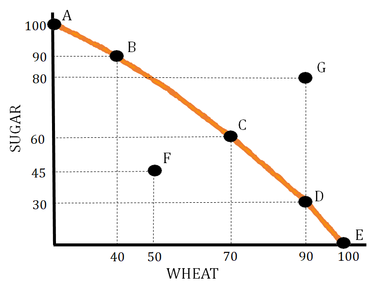
- Allocative Efficiency—This means we are producing at the point that society desires. This is represented by a point on the PPC that meets the needs of a particular society. If a particular society needs about an equal amount of sugar and wheat, the allocatively efficient point would be C on the graph below.
- Productive Efficiency—This means we are producing at a combination that minimizes costs. This is represented by any point on the production possibilities curve.In the below graph, productive efficiency is achieved at points A, B, C, D, and E.
- Point F in the graph below represents an inefficient use of resources. This point can also represent higher than normal unemployment.
- Point G represents a production level that is unattainable. At this point, you do not have the needed amount of resources to produce that combination of goods.
Opportunity Costs and the PPC
The PPC is especially useful for us to measure opportunity cost. As a reminder, opportunity cost is the loss we accrue by making a trade-off. Using our butter-guns example, we have to give up making some butter if we choose to make more guns. On the PPC, this is represented by moving along the curve. Observe that as we move right, producing more butter, we necessarily have to produce less guns to stay on the curve. To see this, start at point B and move right until you are above point D. To move onto point D, you must move down, representing a loss in gun production. Otherwise, you're above the curve, which is unattainable. This change in guns from B to D is the opportunity cost of producing the additional butter (rightward movement) from B to D.

Increasing and Constant Opportunity Cost
You might notice that moving from B to D, the change is much flatter than moving from B to D. This is because of a concept called increasing opportunity cost. As we produce more butter, the amount of guns we can produce decreases faster and faster. To put numbers to this, suppose B to D was an increase in 5 butter, but a decrease in 2 guns. D to C might be an increase in only 3 butter, but a decrease in 5 guns (these are made up numbers). In the B to D example, the opportunity cost was 2 guns given up for 5 butters gained, or 2/5 = 0.4 guns given up per butter produced. In the D to C example, the opportunity cost was 5 guns given up for 3 butters gained, or 5/3 = 1.66 guns given up per butter produced.
Opportunity cost can be thought of as the slope of the PPC. The steeper the PPC between two points, the higher the opportunity cost. With a bowed-out curve like the one above, opportunity cost increases moving right.
Opportunity cost can also be constant. That is, you give up the same amount of guns for the same change in butter regardless of where you are on the curve. This is visualized as a straight line for the PPC. This PPC has a constant slope, meaning constant opportunity cost:
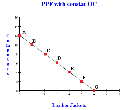
Try the exercise we did with the guns-butter example, moving between two pairs of adjascent points, and see how the opportunity cost changes (or doesn't change)!
Economic Growth
The PPC also can represent economic growth.
Economic growth is shown by a shift to the right of the production possibilities curve.
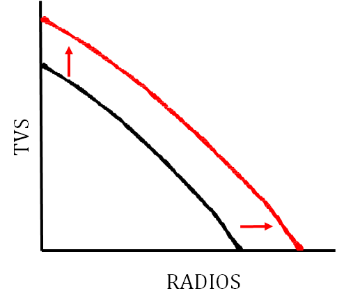
When the economy grows, we can produce more of both goods, meaning the entire curve shifts outwards. This may make some previously unattainable points attainable.
Economic Contraction
Economic contraction is shown by a leftward shift of the production possibilities curve.

Shifters of the Production Possibilities Curve (PPC)
There are several factors that can cause the production possibilities curve to shift. These factors include:
- Change in the quantity or quality of resources
- Change in technology
- Trade
The production possibilities curve can show how these changes affect it as well as illustrate a change in productive efficiency and inefficiency.
Here are some scenarios that illustrate these shifters:
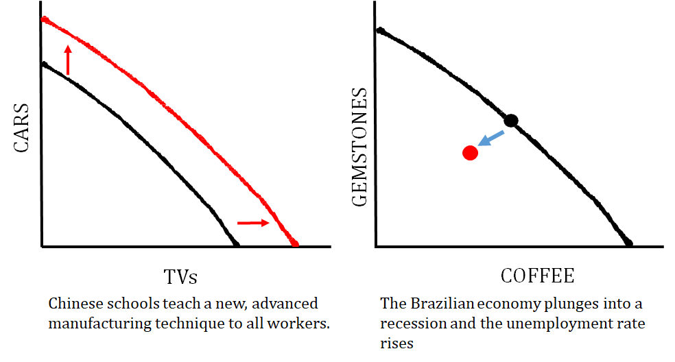
The graph on the left shows how an improvement in the quality of resources (human capital!) causes economic growth. The graph on the right shows what happens when a country is producing at an inefficient point due to high unemployment.
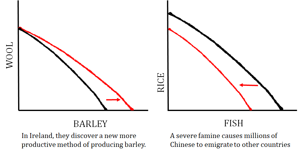
The graph on the left shows a technology change that just impacts one good that a country produces, and the graph on the right shows what happens when the quantity of resources changes (i.e. number of workers decrease).
Browse Study Guides By Unit
💸Unit 1 – Basic Economic Concepts
📈Unit 2 – Supply & Demand
🏋🏼♀️Unit 3 – Production, Cost, & the Perfect Competition Model
⛹🏼♀️Unit 4 – Imperfect Competition
💰Unit 5 – Factor Markets
🏛Unit 6 – Market Failure & the Role of Government
📝Exam Skills: FRQ/MCQ

© 2023 Fiveable Inc. All rights reserved.